Redecorating for Spooky Month!

Today is October 1st, which means that my favourite month is here! This has always been my favourite month, admittedly mostly since it's my birthmonth, but also because it's spooky!
Despite my country being heavily Americanized, Halloween isn't really a thing here, or even any similar celebrations like Day of the Dead. Not even schools here do anything, even the heavily-Americanized bilingual ones don't do anything spooky, and at most do stuff like "Character Dress-Up Day", which to be fair was quite fun and I've always enjoyed, but it still just felt like a Halloween Lite without any of the spookiness that made it unique. Worse still, in this country we love Christmas, which is great, don't get me wrong, but here we start it way too early, to the point where some stores here are already putting up their Christmas decorations by the end of September, which to me makes it look like they're fully skipping over October.
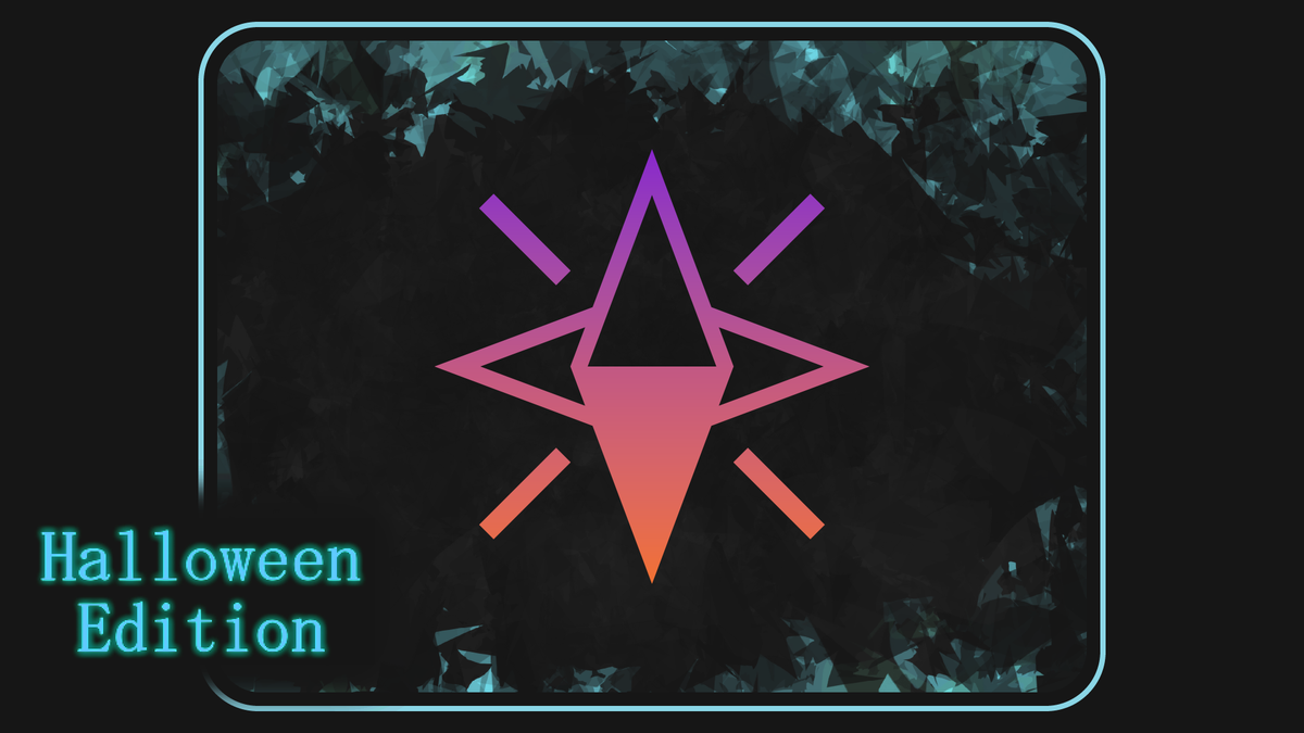
I've always really disliked this, I felt like it made my month completely unremarkable, and even somewhat taboo, so now I'm doing something about it for myself! Throughout all of October the logo and accent colours of this site will now be purple and orange!

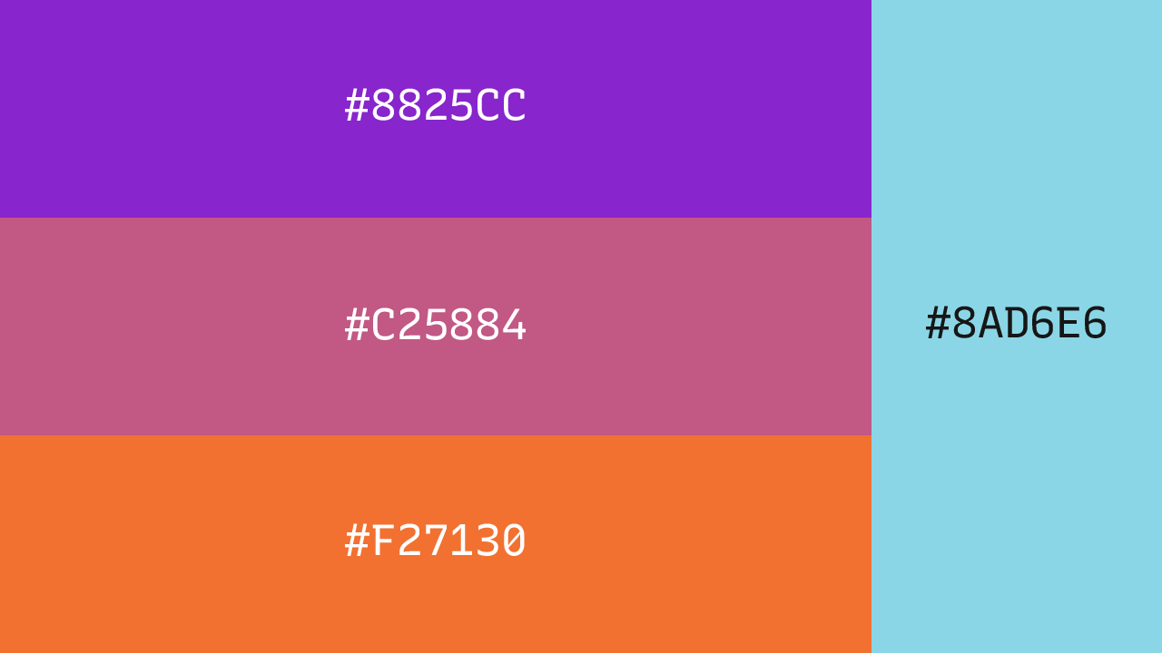
I'm actually very excited to be doing this! I've actually had this idea since February when I made my site gold for Centurion Week. When I did that I also made this version, at first as a test, but then I thought that purple and orange would work great for a spooky theme, and so I went with that! As October approached I fine-tuned the gradient a bit until I was fully happy with it, and made the decision to add cyan as an additional accent colour for the wordmark and the banner, which I think turned out great!
I'm always one to root for the underdogs, and that's why I'm more than happy to represent my favourite month like this. In case anybody is curious, here are the specific colours!
Btw, I did actually make a small change to the wordmark of the blog a while ago that I don't think I've actually explicitly said here before. I changed the y to have a straight line at the end instead of curving, which I think looks cleaner.