The Map That Started It All

Since 2012 (seriously) I have been watching this show called Battle For Dream Island, which is an animated show originally made by just two brothers, Cary and Michael Huang. Aside from the show, the both of them have also made a bunch of other stuff, and in some cases these have been super influential to me and my style.
Michael specifically has a very distinct style of animation and graphic design, and in 2017 he started a series called How Made where he showed behind the scenes of some things he created! Recently he announced that the series would be returning, with the first new episode coming out tomorrow (August 15) which I am super excited for!
To celebrate this occasion, I wanna bring up a very small and relatively unknown project he did around this time, that actually ended up being one of the most influential things for me creatively.
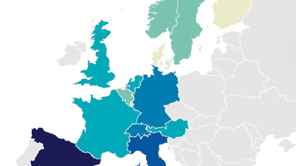
On March 23, 2017, Michael released this video showing an interactive map of the fastest 3x3 average per country. Interestingly enough, this released a few months before I got into cubing thanks to Cary, but it didn't really make an immediate impact, and I didn't really give it much thought.
About 3½ years later, though, I rewatched that video and was suddenly extremely inspired. I don't remember why exactly. Maybe it was because of the fact I was getting more into geography, or maybe the colours just looked extremely nice to me (I've always adored blue-green-yellow gradients), but either way this map had me hooked.
Even though the interactive version itself is/was broken even at the time, a part of me just clicked with this map and just wanted to be able to do things like it. On November of 2020 I created my first ever attempt at a statistical map, which I made for a Social Studies project about Dominicans migrating to different countries.
Now, full disclosure, this is not a good map. I created it using Procreate, a raster-based drawing app for iPads, and so it doesn't look that good. Additionally, the map is full of mistakes as I filled in each country using what's essentially a very basic fill bucket tool, and I barely had any knowledge of actual detailed geography.
Because of this I made some very silly mistakes, most noticeably putting Corsica as part of Italy.
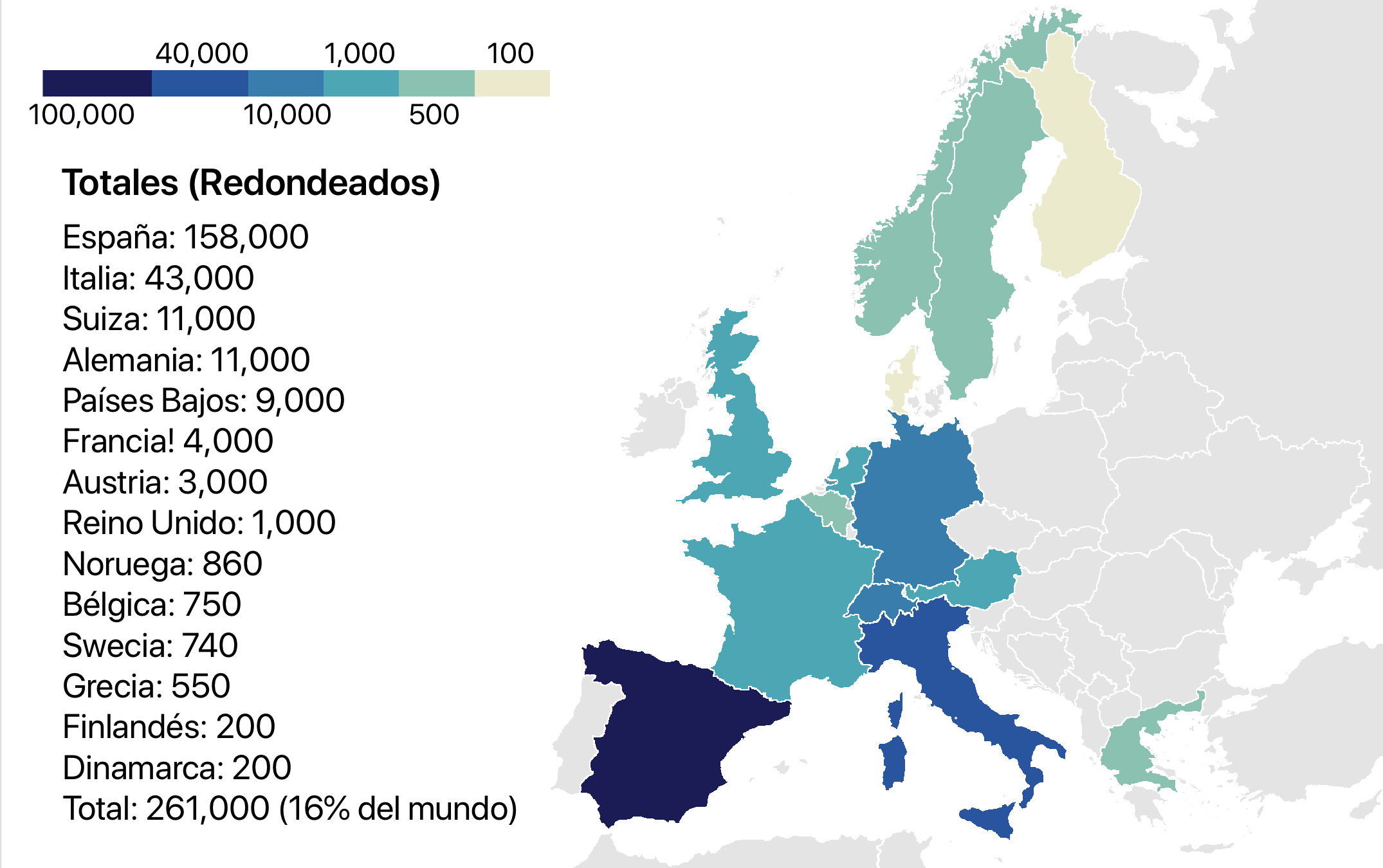
Despite all of that silliness though, this is still a map I look back on fondly.
I felt extremely proud of it at the time, despite knowing it wasn't the best, it was enough! It sparked my interest in this kind of infographics, and showed me that I did have the capacity of making them myself.
Of course, this is the start of the creative process. This map showed me it was possible to make this type if thing, and I kept going, eventually doing the best possible in Procreate, and then moving onto vector software like Inkscape and Vectornator.
I kept making things and I kept improving, and I have reached a point where I am feeling extremely positive of my skills in not just making maps, but all sorts of infographics and graphic design stuff in general.
All of this wouldn't have been the same if it weren't for that map Michael made, and so I am extremely grateful for it! From the specific map, to the colour palette, I have definitely taken a lot directly from it, but all throughout the basic template helped me be more comfortable experimenting and finding my own style.
Thanks Michael!