Reworking This Site's Design
The official launch of EyeSpark v2.0, I guess!

Last Monday I celebrated my 100th post on this site, and for the rest of the week I ended up uploading a new post every single day. I am now retroactively calling this event "Centurion Week".
Amongst many of the things I did during it, I changed the logo and the site's accents to be gold instead of blue/green just for that week! I loved doing this, even though I knew it would only last for a few days. Halfway through it, though, I got an idea that when it was done I should not just revert the site back to its original colours, but maybe see if I could make it even better.
And so, I spent part of Centurion Week and the last two days to rework some of the designs of the site, and I want to share what I did in detail today, now that it's officially done!
First of all, the logo. I did not change the EyeSpark itself, as it is pretty much perfect for me as is, but I did change the colours to be slightly more vibrant, as I found out they were slightly muted in the original file somehow. The blue of the logo and the rest of the site is now #38a5b4, and the green is #b2ffb8, which are both slightly more saturated than the previous ones!
But now, to accompany the logo I made a typemark for it! I had a very good idea of how I wanted it to look like, but I couldn't find any font that fit it exactly, so I did it myself.
I used the PT Mono font as a base, and I made some slight adjustments by adding or removing serifs when needed, and changing up a few of the specific shapes. I ended up with this, which I am extremely happy with!
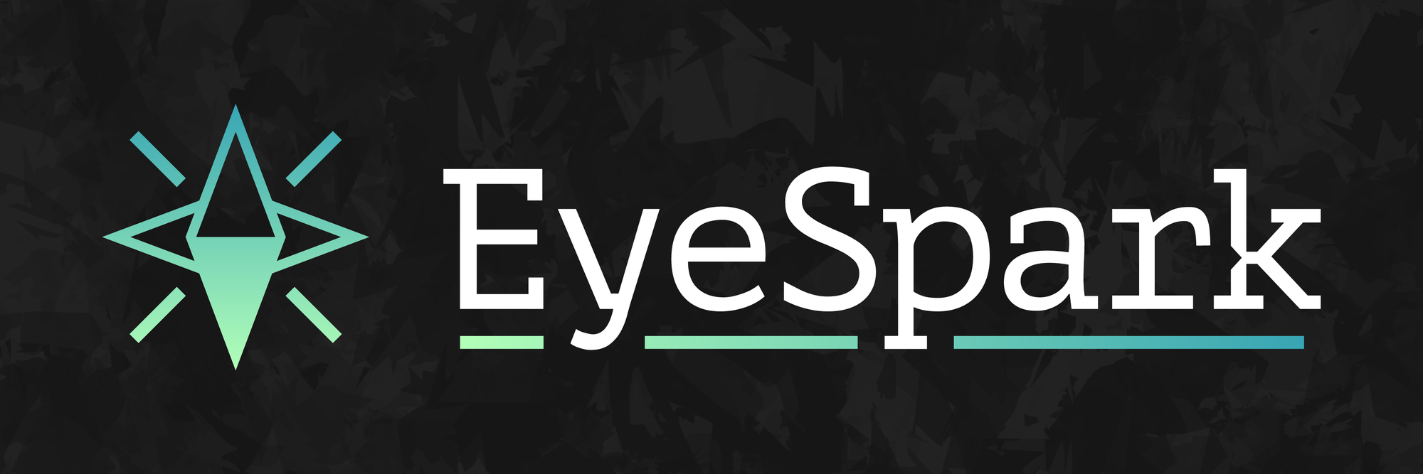
I also changed the background for my banner as well, as seen above! I made it in Procreate using only the Rad brush, which is probably my favourite brush with a unique texture like that. I found the perfect way to mix it with the shades of the site to make it exactly how I wanted it to be.
The original background also used it but mixed with a lot more textures, and it ended up looking much darker and grungier than I wanted (even though it did look super awesome). Meanwhile the new one is practically perfect for me.
And now I want to talk about the site itself! I was happy with the graphic design changes, but I decided that if I really wanted to switch it up I could do a lot more than just the logo.
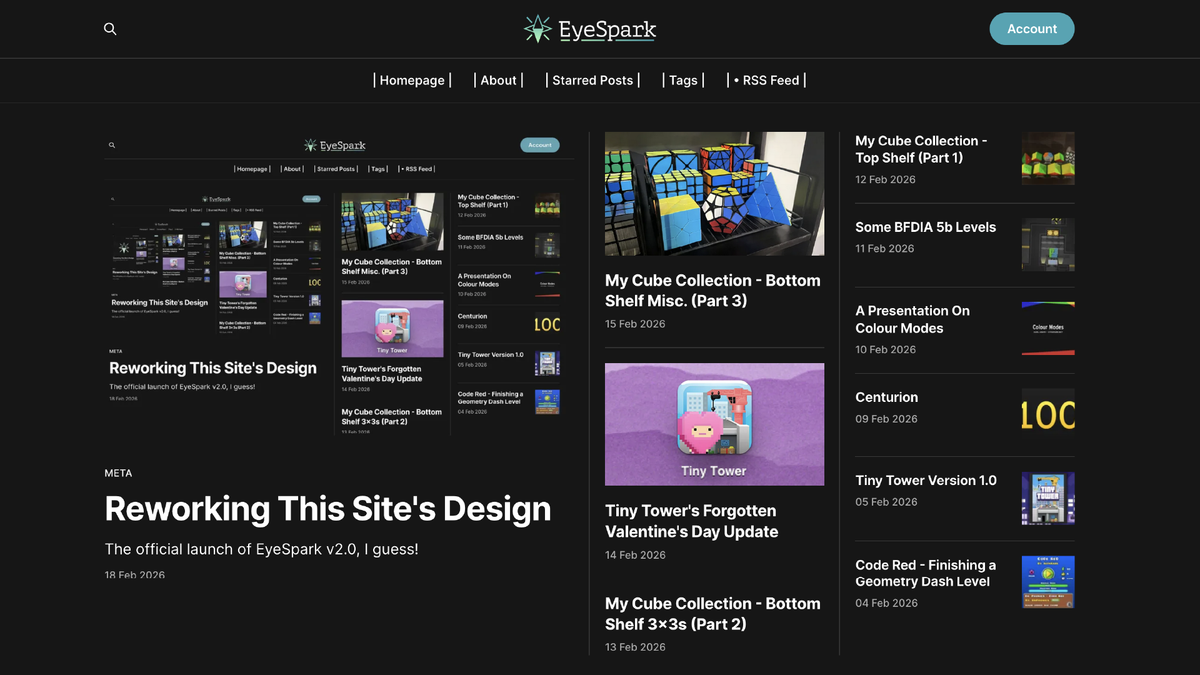
I changed the homepage from the standard linear layout to the Highlight layout that Ghost provides. This view now provides space for a lot more posts while still keeping them very organized, and also highlighting the most recent posts a lot more.
Aside from that, I also changed up the top bar. Everything used to be in a single row, but I've changed it to a stacked view with the logo, search button, and email updates moved to the top, and the navigation buttons are now in their own row just below. I also formatted them a bit differently, just for funsies.
Along with that new layout I also added two new pages to the navbar!
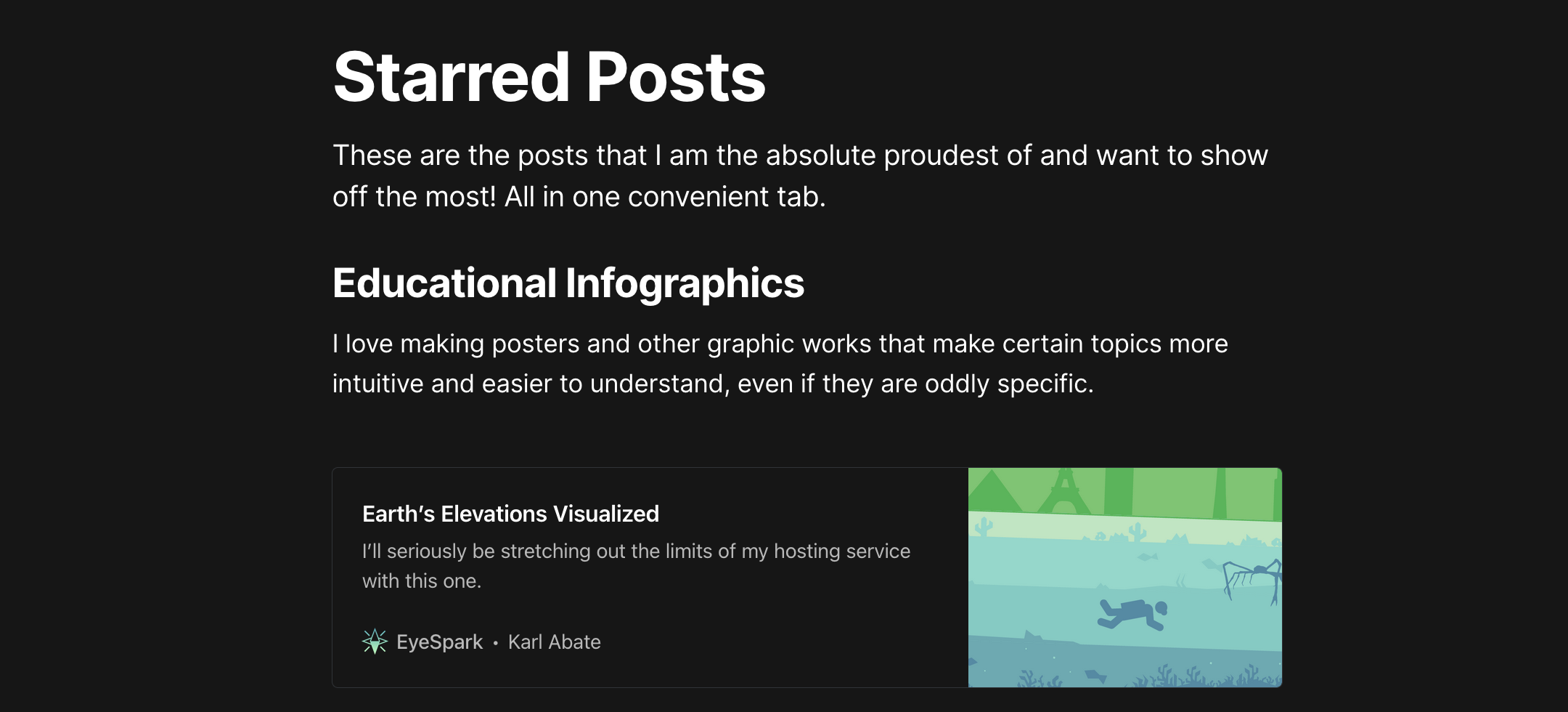
Firstly, I replaced the old "Start Here!" page with a new "Starred" page, which is essentially the same idea but way more organized and up-to-date. This page shows the posts that I am the most proud of and would generally show people when introducing them to what I do.
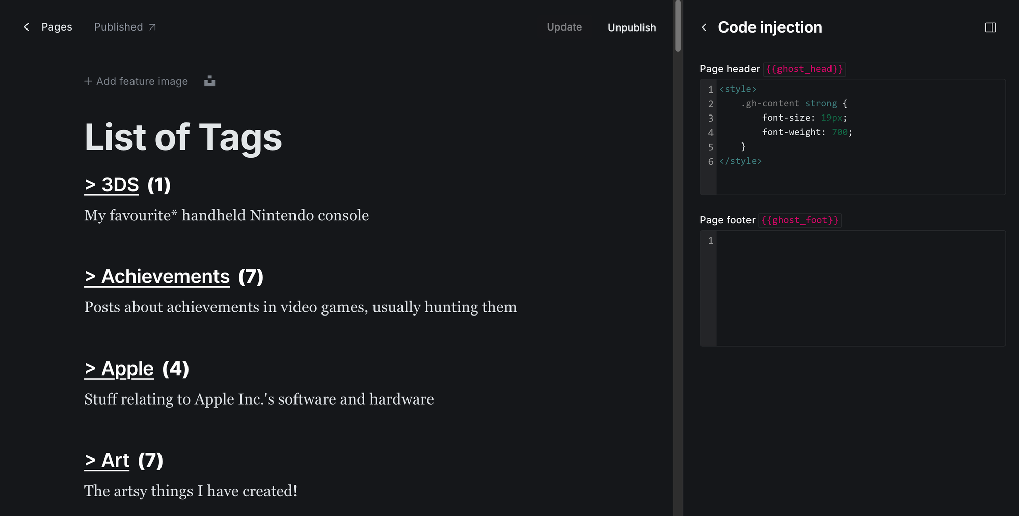
And secondly, I finally created a Tags page for the site. I spent literally all of yesterday doing this, as I had to do it manually.
Some premium/custom Ghost templates have a page that do this automatically, but I had to make do with the one I have. I also did want to add descriptions and images to every single one, which took more time, but still.
Fortunately, it went pretty much perfectly! Every tag is in a list in alphabetical order, and it shows the description and a count of how many posts I have made with each one, with some nice formatting I did in the code injection (thanks Cathy!).
Since it is a manual page I have to update myself every time I change or make a tag, or even make new post, which will require some upkeep, but I think it's worth it!
And that is pretty much it for EyeSpark v2.0! (As I guess I am calling it now)
I am so glad I finally got to put this together. Some of these ideas have been in my mind literally since I started the site, and I am so happy to finally have them come to fruition, especially after an already amazing week.
I don't plan on making any big changes to the site in the near future, as I am very happy with all this. I do have plans for colour palette changes for more special occasions, so you can definitely expect the gold to return some day, but I will keep those secret for now.
Thank you for reading, and supporting me and my blog throughout EyeSpark v1.0! Here's to the next!