Thinking About Left 4 Dead's Main Menus

Recently I decided to get on with finishing 100%-ing Half-Life 2 (plus its episodes since they are bundled in now), and just today I was in a call with a close friend trying to do just that. Specifically I was getting the Get Some Grub achievement which is the worst thing I have done in any Valve game ever, to be honest. It was so bad I needed that friend for emotional support, lol.
Anyways, I am as much of a rambler with my friends as I am on this blog, so once I was done with it and saw that the menu was set to the one in the mines, I joked about it at first… And then I proceeded to ramble about the other main menus of Valve games for the following 10 minutes or so, since it's something I actually think a little about sometimes!
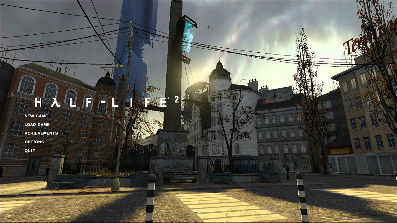
With the release of the Source Engine, all of the games in it had an extremely simple and similar style for its menus. All of them just had the title of the game, and the simple menu options in the Verdana font. The background was either a still image (such as in Counter-Strike: Source or HL2: Deathmatch) or an actual in-game map (such as in Half-Life 2, its episodes, and Half-Life 1: Source).
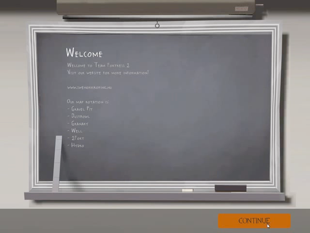
When The Orange Box came out it didn't really see a ton of improvements. Portal kept the same formula from HL2, but Team Fortress 2, despite being very simple, had a completely different font and unique theme! And it definitely evolved into something larger later on.
The biggest improvements of them all, though, would come with Valve's next big games, the Left 4 Dead series. Which is the actual focus of this entry! (Long intro, I know).
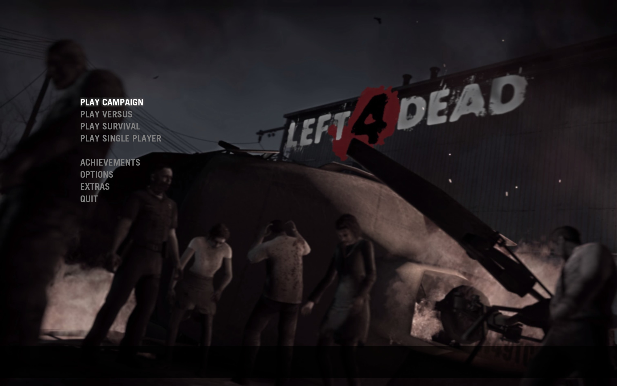
With the release of Left 4 Dead 1 in 2008, came the first Valve menu to seriously transcend the formula, with the only thing to really carry over being the animated in-game background. The font used was completely different, being Trade Gothic, and instead of the logo just being plastered onto the menu, it was actually part of the background itself!
The menu by itself remained as intuitive and simple as ever, though! Despite changing some of the things that had become a bit more standard, such as the Achievement and Options menus, everything still remained very much recognizable and easy to locate!
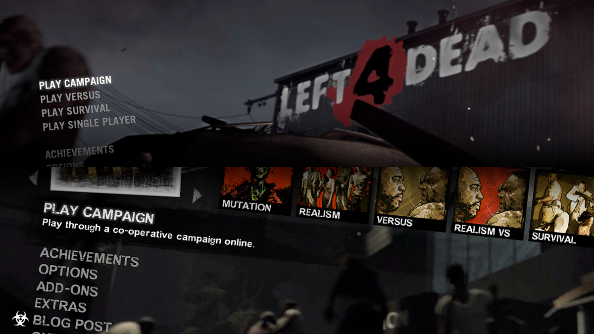
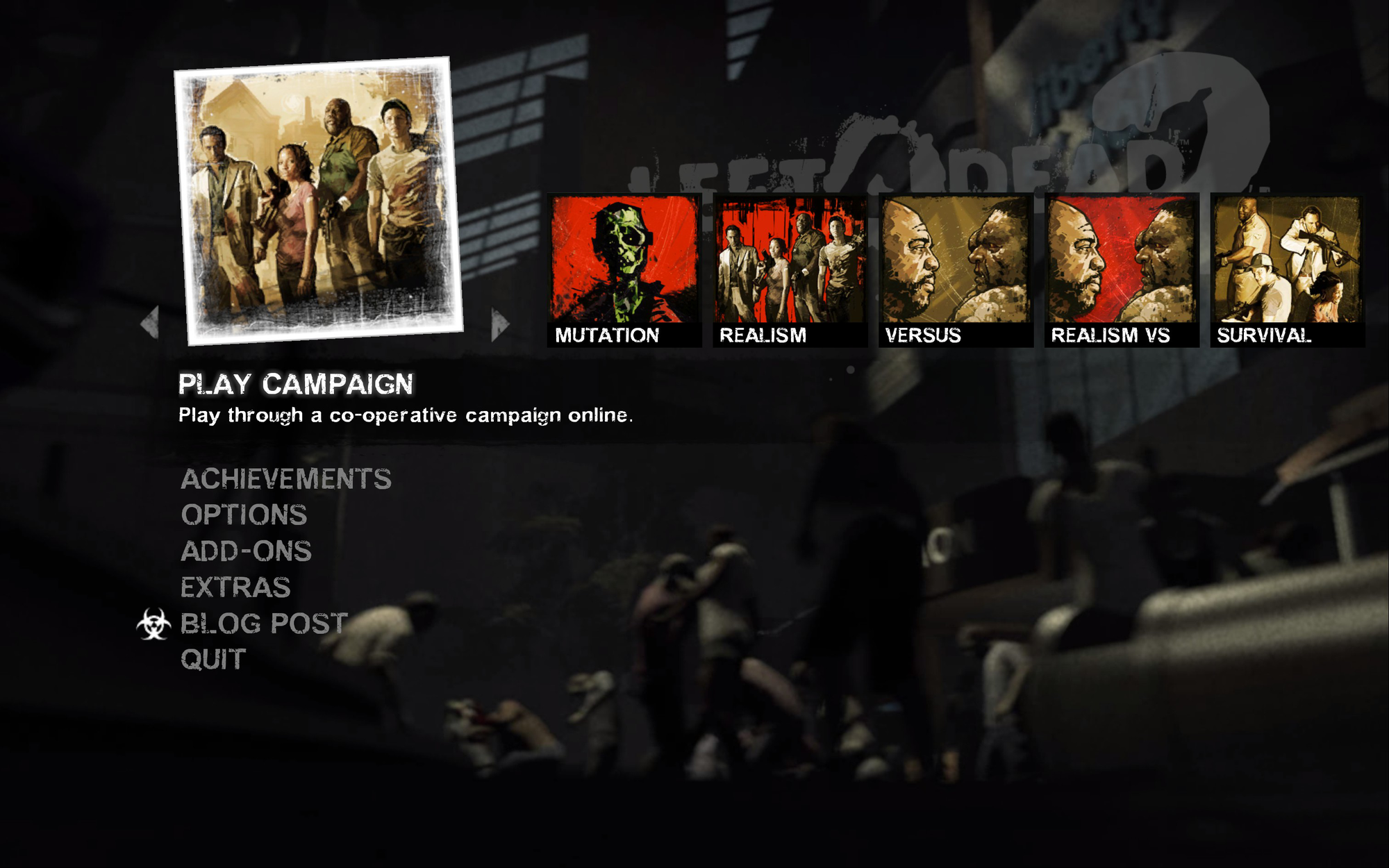
Exactly one year later, Left 4 Dead 2 came out, and despite the previous game having completely restructured the standards of Valve's main menus, its sequel decided to do it again!
It kept the same idea for its background, except it did not have the diegetic logo anymore, instead having it be large and plastered onto the main menu itself once again, but this time with some transparency and on the top right corner.
The font used is an edited version of Arial made to look a bit more worn and grungy, which despite being the standard font, the added texture of the variation actually adds a lot of personality, sticks to the theme and still looks very good! The specific font is called Stubble (the official link for the font seems to be gone, so here is a link to the file on WhatFontIs).
Really, the biggest change was with the actual layout of the information. The first game had its gamemodes as just regular menu options one on top of the other: Campaign, versus, survival, singleplayer. Instead of just text, though, in L4D2 all of these options have icons which you scroll through on the menu! Even if it isn't as intuitive as the standard menu, this adds a whole new layer of personality to the menu! Which to me evokes the more spectacular and movie-like nature of these zombie games, mostly thanks to the posters.
(Also this is a small touch but I love the radiation symbol as an icon for the blog section, I love when symbols for menus are based on what the games are about!)
Both of these games completely changed the formula of main menus for Valve games, and probably just video games as a whole too! Although the first game has an extremely clean menu that is probably easier to get through, the second game had so much personality that it really makes up for it! Amazing things could really be taken from both.
I adore these menus so much, and it is really hard to pick a favourite, especially when Valve have become such masters of menu design, being able to design something easy to navigate with so much personality. Ultimately though… if I had to choose…
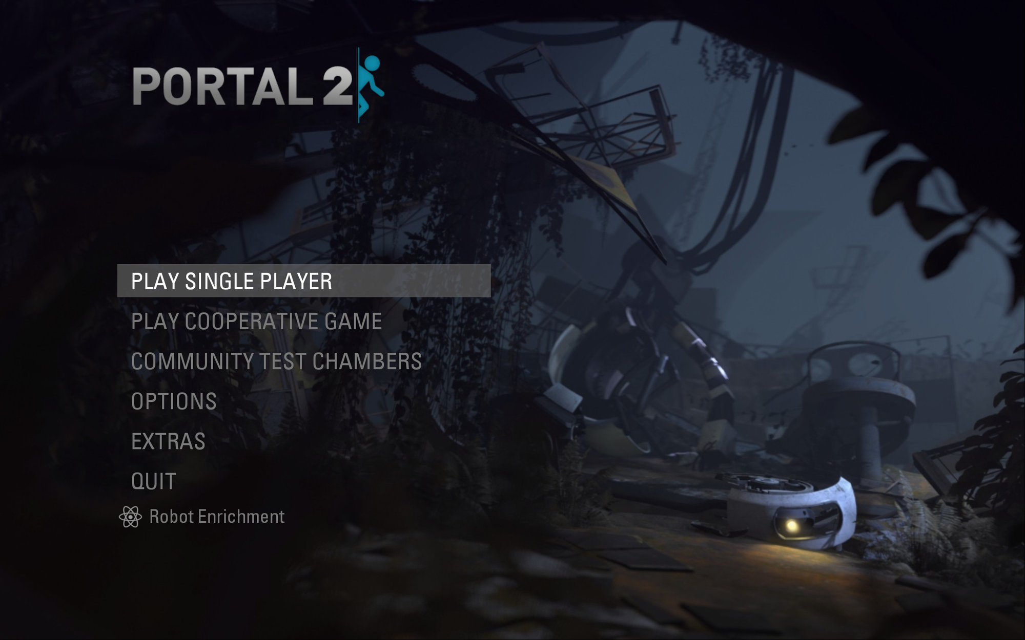
… Portal 2 clears. It is extremely organized, it uses the amazing Univers font, it has a very neat tiling effect for moving between menus, and it has the best sound design of them all.
Note
The oldest source of the main menu of TF2 I can find is from this video by Evili, released a few weeks before The Orange Box even officially released. I used this video for the image. I am not completely sure if when the game actually launched the menu looked like this, but it definitely did in the beta.